First, Happy July 4th! 'Murica. Second, I apologize for my absence…again….I was in a relationship that literally sucked my life from me. Now that I'm free, I've come bearing gifts, er CyberDrive Ninja updates.
—
Weapon Mods
For two years I've been searching for a weapon modding system. Sure, there's a few around, but they either didn't have all the features I wanted or they were incomplete/unsupported/riddled with bugs. This changed last night when I found an Indonesian site dedicated to RPG Maker. There was a topic that had a pack of scripts from someone named Yeki. Long story short, I've found a modification system that fits my needs (almost) perfectly. The image shows the first mod, which increases base damage (ATK) by 10. I can create a wide array of mods with either one or more stats and all mods are stackable; prepare to make builds, people! The only thing I'm struggling with now is adding elements to the mods. I technically can add elements but I don't know if it's working properly in-script; there's no way to tell. Needs further testing.
—
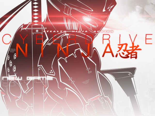
Title Screen
Not sure if I ever posted this but the title screen has also changed. It's not much right now as a single image, but in-game, if moves. There's fog layers, the guy's eye glows, and the text waves back and forth. Funky stuff.

—
New HUD
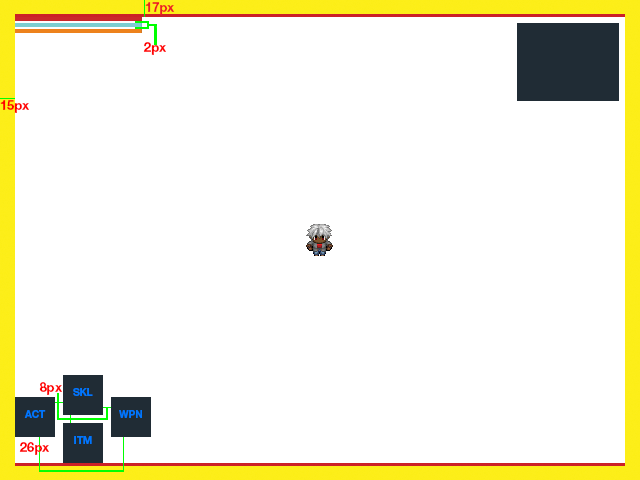
Now, on to the HUD. I've also been stuggling with the HUD design. My goal is to make a HUD that doesn't have the players looking all over the screen to find information. I want to keep all info concise and away from the play area. I've tried micking some of my favorites like Warframe and MGS4 but they never really quite matched the game. So last night (last night was very productive for me lol) after a long period of searching, I figured out the best HUD structure for the game: Dark Souls 3's HUD.
It's still a WIP and done in Photoshop but I feel this is the best direction so far. The box in the upper-right is the radar.
Dark Souls 3 HUD: http://www.gdunlimited.net/media/uploads/manager/hud-darksouls3-beta-9873.jpg
CyberDrive HUD:

—
Any thoughts? Suggestions?
Comments (3)
Leave a Reply
You must be logged in to post a comment.


Black Mage
Just drop in to say that the title screen is AWESOME!!!
Love the white line, love how the gradient turns out, and love the shining eye.
Btw, is the jagged font is intended? A bit weird for me, but I think it's like that for some effect.
Also, I can't find the new game choices on several first glance lol.
Anyway great job on that title screen 🙂
Black Mage
Oh, the jagged font is like that because it's should be moving, right? Somehow I want to see them in action 🙂
Roody I
Yes the jagged text is actually moving. I do have a video on YouTube with the title screen but I made it private two nights ago. I'll change it and post the video 😀